 |
| The course categories are nicely laid out as buttons with text and images. very nice! |
I. HARTPURY COLLEGE'S MOODLE SITE WITH THE RENDERER IN ACTION
The renderer also works great with subcategories, as evidenced by the next screenshot.
 |
| Even sub-categories are rendered as informative buttons. Nicely done. |
II. INSTALLATION AND TECHNICAL INFORMATION
As explained here, Alicia Wallace's contributed renderer that will display category names as either the default list, or as buttons - if an image named after the category number is posted to the correct folder.
It's still being tested and isn't perfect as "long category names can prevent the buttons from stacking properly, for instance". The renderers.php file is based on the Sky High theme, but hasn't been tested with any other themes.
| Step-By-Step Installation Instructions |
To install, assuming you are using the Sky High theme:
1. The category button images should to be uploaded to the /theme/sky_high/pix/catimg folder.
2. The catimg.css file is stored inside the /theme/sky_high/style folder.
3. Upload the renderers.php file to /theme/sky_high.
4. Create your categories.
5. Move your courses into the various categories.
6. Go to Administration | Site administration | Front page | Front page settings
7. Change Front page to show "List of categories"
8. Change Front page items when logged in to show "List of categories"
9. Set the Maximum category depth value to 2 or 3. You may choose to experiment with this,
depending on the structure of your categories.
8. Take note of the of the integer value of each category. In my case, I have 3 categories:
http://www.moodurian.com/cefl/course/index.php?categoryid=1
http://www.moodurian.com/cefl/course/index.php?categoryid=2
http://www.moodurian.com/cefl/course/index.php?categoryid=3
Therefore, I created three png files: 1.png, 2.png and 3.png (use lowercase convention).
9. Create your png files. Make sure the dimensions of each png file is Width: 220px, Height: 86px.
10. Edit your /theme/sky_high/renderers.php file and change the text hartpurynew to sky_highas in from:
to:
11. Save your /theme/sky_high/renderers.php file
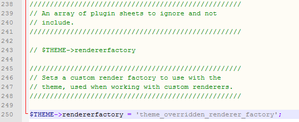
12. Add this line to the end of /theme/sky_high/config.php:
$THEME->rendererfactory = 'theme_overridden_renderer_factory';
as in:
13. Go to Administration | Site Administration | Appearance | Themes | Sky High
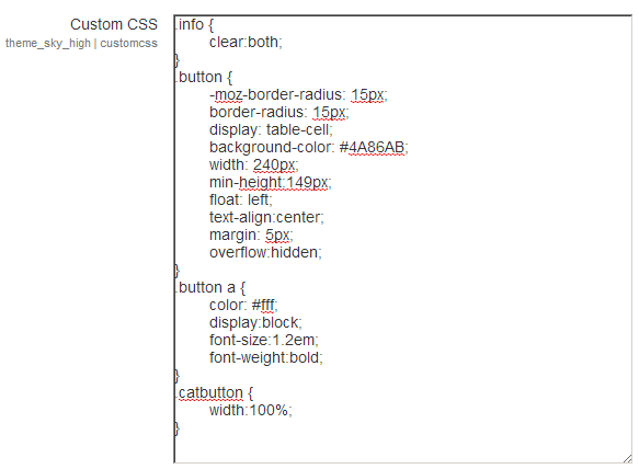
and copy and paste the catimg.css code into the Custom CSS edit box. You may want to change the
background colour of the button from #c33 (red) to another colour code that matches your site's
theme colours. In my case, I used #4A86AB to change from red to a blueish hue.
 |
| Copy and paste the CSS code into the edit box from here |
III. SCREENSHOTS OF RENDERER-ENABLED SKY HIGH THEME
When previously the same screen would look like this...
...now here's the result of Alicia's renderer.php and CSS code on my site, using the Sky High theme.
What do you think?
 |
| Categories as buttons. Nicely done. And it's automatic! |
Not too bad, huh? Don't you just love it when the code automates the formatting of the categories and subcategories into buttons for you?
IV. HIDING THE "COLLAPSE ALL" AND "EXPAND ALL" LINKS
There is another thing I have to mention.If you notice carefully, you can see the "Collapse all" and "Expand all" links in the middle of the screen. For some strange reason, they don't work when clicked. I think it's related to this Tracker and is Moodle 2.5 related. Anyway, those 2 links work when you set Combo links to show in the Frontpage settings. To hide the two links, edit /course/renderer.php by commenting these two lines inside the coursecat_tree function (be careful! If you are really going to do this, please record this change somewhere as this is editing core Moodle code! I wouldn't want your next Moodle upgrade to break on my account):
protected function coursecat_tree(coursecat_helper $chelper, $coursecat) {
...
/* $content .= html_writer::tag('div', get_string('collapseall'), array('class' => 'addtoall expandall')); */
/* $content .= html_writer::tag('div', get_string('expandall'), array('class' => 'removefromall collapseall')); */
...
}
Here's that screen again. Now I've added a fourth category -Admin.
 |
| The "Collapse all" and "Expand all" links are now hidden. |
V. SHOWING SUBCATEGORIES AS BUTTONS
There is one last thing I must highlight. In my example, I've added two subcategories, both under the Admin category. If you have a category-subcategory hierarchy, then it is advisable to set maxcategorydepth to 1.
This will allow you to display your subcategories as buttons - provided you upload the appropriately named PNG files to represent the ids of the subcategories. In my example, the Admin category contains two subcategories - Student records (categoryid=4) and Assessment Archive (categoryid=5).
Here's what happens when I click on the Admin button (after setting the maximum category depth to 1). It shows the two subcategories as buttons in all their glory:
 |
| The subcategories are shown as buttons. This will only work if you have a 220 x 86 pixel image for every category pr sub-category. |
Here's the front screen again, this time I've enabled the category buttons with the Ergo theme. The redundant (in Moodle 2.5 that is, this will not be redundant in Moodle 2.6) "Collapse all" and "Expand all" links are now gone:
 |
| The Ergo theme with all categories are shown as buttons. |
One final look at the sub-categories screen in the Ergo theme.
So now, back to you, dear Moodurian blog Reader. Care for a download?
To save you the trouble, you can download my entire Sky High folder here. I am using Moodle 2.5. Remember that my image files are 1.png, 2.png and 3.png as I have three categories numbered, 1, 2 and 3. So please change the numbers as per your own category values. Remember to clear your Theme cache often when attempting this stunt...erm, 'hack'.
VII. CONCLUSION AND CREDITS
In my opinion, Alicia's contribution brings some order to the Moodle frontpage. I feel that it displays categories and subcategories in an attractive manner. Each button is like a block with image, text and colour background. What excites me is the background colour can be the same as your corporate colour. This will emphasise the branding of your company or educational institution.
Thank you, Alicia Wallace, for your contribution to the Moodle Community. Give and it shall be given unto you! Give it a try today. Stay calm and Moodle along.
Regards
Frankie Kam


No comments:
Post a Comment