The Moodle Wall just got better - My Christmas 2014 gift to the Moodle community. Merry Christmas!
 |
| Source: https://unknowncystic.files.wordpress.com/2011/12/xmas-gift.jpg |
The Moodle Wall for Moodle 2.x just got better. Much better. And the best part is that, in the spirit of Christmas and Open Source, I am giving away the prized source code to all Moodle developers and students. For free. You are free to modify the source code as long as you give credit to two persons: Srivinas Tamada of India, and Frankie Kam of Malaysia. And as long as you fulfil a list of requirements from me. More on that list at the end of this post.
For now let me take you on a tour of the FIVE improvements of the Wall.
So what's so great about this version then?
1. Instant Simple Input Mode
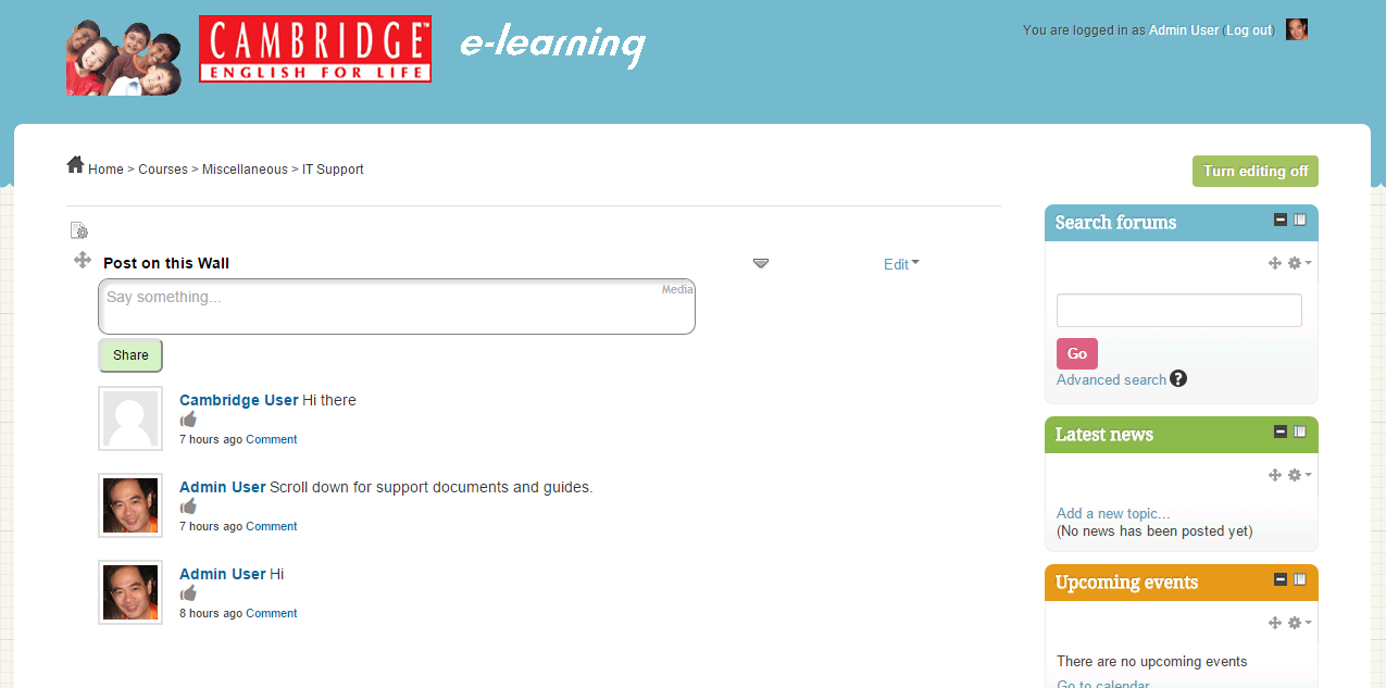
Improvement #1. Upon loading up of the webpage, this latest version shows the input text box in Text-Input mode. However, if you click on the "Media" link on the top-right corner of the wall, the input box transforms into Media-Input mode.
This was never the case with previous versions of the wall which always, by default, showed the Media-Input mode edit box first. By showing the text-mode edit box first, the user is faced with an uncluttered input box and then can toggle the media-mode on and off at will.
As far as I know, this is the only Wall input box in the world that toggles between two modes. A world-first. Malaysia-Boleh, mah! Perhaps in the case of Facebook, Yammer, Chatter, Joomla and a myriad other social media platforms, there is not a need for the user to input formatted input. In my case, I think that allowing the user to enter formatted input is cool. Cooler than Frosty the Snowman.
2. Easy Installation
Improvement #2. Previous versions of the Wall were an absolute pain to install. I'll readily admit it. I mean you literally had to edit the code in a text editor like Notepad++. You had to do Search-and-Replace with code. It was pretty scary for non-coders to do.
This time however, the good news is that all you need to do is to create sub-folder named 'wall' inside the main Moodle folder of your web server, for example: public_html/moodle/wall. Then, you need to just FTP the entire contents of the Wall code - files and sub-directories - into that subfolder wall. Assuming that your MySQL user table is named as the Moodle default of mdl_user, then all you need to do is to create a label and paste in the sample code below, to create the Wall. Like so:
<center>
<iframe width="100%" scrolling="auto" height="900px" frameborder="0" align="middle" name="Embedded Frame" src="http://www.yourdomain.com/moodle/wall/index.php?Order=0&CourseId=3&Id=1&Likes=1&AdminOnly=0&Email=0&Desc=Post on this Wall" marginheight="4px" marginwidth="4px">
</iframe>
<p></p>
</center>
That code will produce this on your beloved Moodle site:
3. Embedding Media
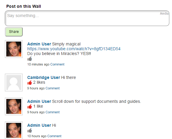
Improvement #3. Amongst other things, I made the Wall much easier to use when embedding images, Youtube videos and TED videos. For example, posting this Youtube URL link of a historic event in sports history...
results in this:
More effective is actually embedding the video inside the post, sandwiched by pre and post text. Like this. Before:
After hitting the "Share" button you get this!
What gives me much delight is that a teacher or lecturer could post this TED link ...
...in order to pique his or students' interest and to elicit answers in the form of comments to the post:
By the way, entering the same text inside the edit box by using spaces in place of the carriage returns will also work.
It also works on the TED talk links. Notice that I've typed and pasted everything on one line. The long TED URL pushed the work "Talk" down. But actually, it's just one line.
But wait, there's more! You can do the same thing for posts involving images. For example,
gives this result:
Here is a sample comment to the logo.
4. Journal
Improvement #4. I have also added a 'Journal' feature to the Wall. Previously this was only available in the Moodle 1.9 Wall. The 'Journal' feature means that a student user will only be able to see her own posts, as well as those of her teacher's posts and comments. Other students' posts and comments will be hidden. This is similar to the Moodle Q&A Forum type which hides other students' forum posts from a student. The teacher of the course can of course view all students' posts and comments. This is best illustrated below.
Before going into Journal mode, this is what the wall looks like to the Admin user who is a Teacher (Teacher permissions). If a user is a non-teacher, he or she will see the same thing. In the standard (normal) mode, all post and all comments are visible to all enrolled users of the course.
To change the standard viewing mode to the Journal mode, here is the embed code that does the trick. The code below is inside a label resource. Note the blue and red text.
<center>
<iframe width="100%" scrolling="auto" height="900px" frameborder="0" align="middle" name="Embedded Frame" src="http://www.cambridgekids.org/moodle/wall/index.php?Journal=1&Order=0&CourseId=3&Id=1&Likes=1&AdminOnly=0&Email=0&Desc=Post on this Wall" marginheight="4px" marginwidth="4px">
</iframe>
<p></p>
</center>
The Journal=1 code gives the signal that the Wall is now in Journal (a.k.a. stealth) mode!
The & code acts as a separator between two parameters.
So when the Demo User user is logged in, she will only be able to see and read her own posts and comments, as well as only her teacher's posts and comments. All other posts and comments by other students are invisible (and rightly so, depending on what the teacher wants to achieve).\
Zooming out, we can see that Demo User is indeed logged in.
So this is the Journal mode in action. I think that this Journal mode has may applications in the classroom. What do you think?
5. Gamification
Improvement #5. I have added a gamification aspect to the Wall. See the below images:
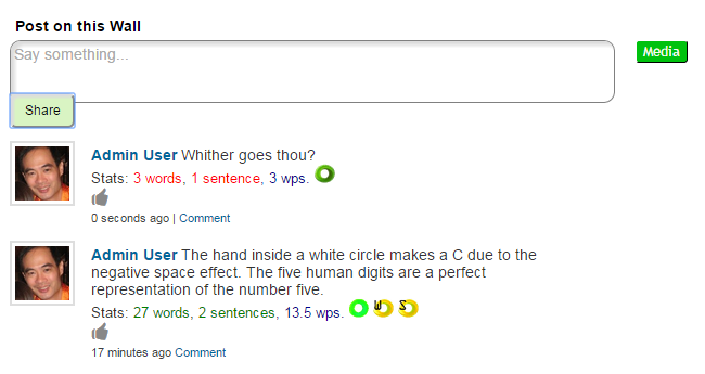
The Wall for Moodle 2.x can now give you some useful statisics:
1. the word count
2. the sentence count
3. the Flesch-Kincaid readability score
If you are teaching English, I think the statistics will be useful for your students. What do you think? Please share your comments and ideas in the comment section at the end of this blog post.
Gamification icons and their meaning
Very readable text
Readable text
Standard readability
Poor readability
Very poor readability
An alternative is to use, at any one time, one icon from this list to represent a degree of readability:
Student has achieved the target of N sentences in her Wall post.
Student has achieved the target of N words in her Wall post.
Student has failed to achieve the target of N sentences in her Wall post.
Student has failed to achieve the target of N words in her Wall post.
An alternative is to just show either one or both of these icons,
and to not show any icon if the student does not post the required words or sentences.
An example screen:
What do you think of this?
I have improved the readability score icons and when you do a mousehover over the icons, a pop-up description, like a tooltip, will appear. This feature was actually built into the Wall for Moodle 1.9. I have finally added this feature in the Wall for Moodle 2.x. I hope you enjoy using it. To activate this feature, you have to add the following bold-faced syntax into the HTML embed code. Like so:
<center>
<iframe width="100%" scrolling="auto" height="900px" frameborder="0" align="middle" name="Embedded Frame" src="http://www.cambridgekids.org/moodle/wall/index.php?
CourseId=3&
Id=1&
Email=0&
Likes=1&
AdminOnly=0&
WordLimit=0&
Journal=0&
Order=0&
WordStats=1&
MinWords=5&
MinSentences=2&
Desc=Post on this Wall" marginheight="4px" marginwidth="4px">
</iframe>
<p></p>
</center>
If you wish to demo the new Wall that I have crafted, please click here and use the following credentials:
http://www.cambridgekids.org/moodle/course/view.php?id=4
Username: demo
Password: demo
6. Why install a Wall on your Moodle site
Here are 9 Reasons WHY you should have a Wall for your Moodle site
| 1. Engage your students | 2. Easily embed Web 2.0 content | 3. Encourage online participation |
|---|---|---|
| 4. Gamify the experience with badges | 5. Allows privacy of posts |
6.
Easily post
content
and code
|
|---|---|---|
| 7. Grab and share Web content on the wall | 8. Increase learning and make it FUN | 9. Post foreign language content |
|---|---|---|
Need I say more? Yes? Okay, here's a Features List Comparison Table
| Features | Moodle 1.9 FULL VERSION | Moodle 2.x FULL VERSION |
|---|---|---|
| Wall post updates | ||
| Comments on Wall posts | ||
| Deleting of posts and comments | ||
| Allows expansion of Web 2.0 content via http input entry. For Youtube, Vimeo, Slideshare, Scribd, TeacherTube, image url. | ||
| Allows formatted input via the WYSIWYG Nicedit rich-text editor | ||
| Textarea is dynamically resized to expand upon input of data; dynamically resized after a post. | ||
| Textarea allows tabbing to be done. Allows indented programming code to be displayed. E.g., C++, .net code. | ||
| Word statistics can be displayed (word count, sentence count, average words per sentence, Flesch-Kincaid readbility score) | ||
| Wall updates can be 'Liked' (Note: NOT the FB like) to indicate usefulness of a post | ||
| Email notifications from student to teacher can be sent each time the Wall post is made I couldn't get this to work on my Moodle site. Maybe it works on your sigte. | ||
| Unicode characters can be shown. Foreign language supported (Arabic, Chinese, Japanese, Thai, Russian, Serbian, etc) | ||
| Users can copy and paste HTML sections of code from webpages and paste them directly onto the Wall | ||
| Journal mode allows users to see only Wall posts belonging to their teacher and themselves | ||
| Wall can be made to be accessed as readonly by students | ||
| Posts can be displayed in reverse order (LIFO). | ||
| Displays any Web 2.0 content as embed code |
7. What the Wall cannot do
1. The upload image feature is not working, and therefore is not found in the Nicedit panel interface.
2. Updates are not in real-time. This is not Facebook! So for a student to see all posts by others, he or she must refresh the browser. Therefore the Wall works like the Moodle forum.
3. No "More" button exists. Yet.
4. The wall can only be activated via iframe embed code. It does not exist as a mod or as a block.
8. Get the code!
If you want the latest code to the Moodle Wall for Moodle 2.x, please send me an E-mail at boonsengkam@gmail.com.
You can also access and download my code from Github or by clicking the download icon below:
Merry Christmas
Frankie Kam
Postscript
I've also changed the Toggle button to a gear image. It now looks more polished.
Appendix
With regards to the Gamification part of the Wall with the Flesch-Kincaid Readability icons, I would like to reproduce a portion of my blog post here which I find highly instructive:
Quote
I also surfed over to these sites:
http://www.readability-score.
and implemented the Flesch-Kincaid Readability score test on the Wall.
(The website www.readability-score.com uses the PHP code available from https://github.com/
So anyway, the readability scores translate as follows:
| Flesch Reading Ease Score | Flesch-Kincaid Grade Level | Typical age | Style description |
|---|---|---|---|
| Elementary School * | |||
| 1 | 6-7 | ||
| 2 | 7-8 | ||
| 3 | 8-9 | ||
| 4 | 9-10 | ||
| Middle school * | |||
| 90 to 100 | 5 | 10-11 | very easy |
| 80 to 90 | 6 | 11-12 | easy |
| 70 to 80 | 7 | 12-13 | fairly easy |
| 60 to 70 | 8 | 13-14 | standard |
| High school * | |||
| 60 to 70 | 9 | 14-15 | standard |
| 50 to 60 | 10 | 15-16 | fairly difficult |
| 50 to 60 | 11 | 16-17 | fairly difficult |
| 50 to 60 | 12 | 17-18 | fairly difficult |
| Post-secondary education (College or University) * | |||
| 30 to 40 | 13 | 18-19 | difficult |
| 30 to 40 | 14 | 19-20 | difficult |
| 30 to 40 | 15 | 20-21 | difficult |
| 30 to 40 | 16 | 21-22 | difficult |
| Graduate education * | |||
| 0 to 30 | 22+ | very difficult | |
Source:
Here's a simplified scale of the scores.
if($n >= 90) return "Very easy";
else if($n >= 80) return "Easy";
else if($n >= 70) return "Fairly easy";
else if($n >= 60) return "Standard";
else if($n >= 50) return "Fairly difficult";
else if($n >= 30) return "Difficult";
else return "Very confusing";
I dumbed it down a bit, since I only have five icons (see attached gifs!), to this
slightly simplified structure:
80-100 : Very Easy
70-89 : Easy
50-69 : Standard
20-49 : Difficult
0-19 : Very Difficult
I programmed the PHP function from the github link into message_ajax.php of the Wall and you can take a look at the screenshot after a typical post. Mouseover your mouse cursor onto the icons and you have a nice popup text description.
So now, you have not only a numeric Readability score, you also have a set of visual colourful icons to indicate the level of readability of the student's wall post.
BTW, I tried the following speeches on the Wall, and here are the results:
Obama's speech at the memorial wake in Newtown, Connecticut = high 90s
Queen Elisabeth I's speech = low 40s
So the Flesch-Kincaid readability algorithm does seem to work fine.
The php code from the github link also allows me to program these readability scores functionality into the Wall:
* Flesch Kincaid Reading Ease
* Flesch Kincaid Grade Level
* Gunning Fog Score
* Coleman Liau Index
* SMOG Index
* Automated Reability Index
The same code also can give:
* String length
* Letter count
* Syllable count
* Sentence count
* Average words per sentence
* Average syllables per word
Endquote


No comments:
Post a Comment