Pages

Tuesday, May 19, 2015

How to view Microsoft Documents on your Moodle site the JQuery way (Part 1)

Microsoft Store. That's a nice logo. Source: http://en.wikipedia.org/wiki/Microsoft

Disclaimer: For Microsoft Office files (Word, Excel, PowerPoint) this only works with  files that are available publicly via a public URL. It won't work for Ms Office documents that are added to a Moodle course as a resource.

Ever since I started using Moodle as a file repository for the teachers and lecturers at my work place, I had always wanted to view Microsoft Word, Excel and PowerPoint files easily on my Moodle site. The easier and faster, the better. You know the story.


Figure 1. Many thanks to Davo Smith and others for
the time-saving drag-and-drop feature of Moodle!


Figure 2. What the file looks, sitting pretty on your Moodle coursepage.


Figure 3. Click on the Ms Word file, and Google
Chrome instantly downloads it. So this means I need to run Microsoft Office to view the file's contents.
Fine and good. Everyone does this. But what if I just wanted to view the file without any fuss?

Figure 4. Using Internet Explorer to access and download the Moodle file resource
invokes a Window prompt like this. Clicking on "Open" gives you...
Figure 5. ..this! You will need at least another two
mouse-clicks before you get to view the file.

So after uploading a Word file to your course page by dragging and dropping, each time you click on the file, depending on which browser you use, the file either gets downloaded instantly or you are prompted to either open the file or download the file. Why can't I just view the file there and then without having to invoke Microsoft Office ?

Wednesday, May 6, 2015

Embed a PDF file (and more!) in your Moodle course page by using ViewerJS. Cool!

Source: https://www.flickr.com/photos/degu_andre/5364417987/
André Gustavo Stumpf, some rights reserved.
If you ever wanted to embed PDF files inside your Moodle 2.x course page, but didn't know how to, look no further than the uber easy-to-use ViewerJS.

At the end of today's post, you will be able to view PDF files and Ms Office files direct off your Moodle course page. How? Read on!

1. Download the Javascript zip file from here.
2. Unpack the file on your computer. You will see a folder named 'ViewerJS'.
3. Upload (FTP) that folder to your webserver, preferably to www.domainname.com/moodle/ViewerJS
3. Upload one or more PDF documents to your webserver, preferably to a custome folder named pdfs. E.g, at the location www.domainname.com/moodle/pdfs
4. Create a Label resource with the example HTML code below


The softcopy code is given here:

Tuesday, May 5, 2015

Enable the Lightbox effect for an image file inside a Folder resource on your Moodle site

Folders by Colleen  Galvin, on Flickr
Source; https://www.flickr.com/photos/col233/7974661195

I am having fun implementing the Lightbox javascript effects on images on my Moodle site. It was just yesterday that I realised that I could upload image files into a Moodle folder resource, but when I clicked on an image file, the file downloaded instead of loading up on-screen. It was then that I decided to see if I could make a clicked file link open up on-screen with the Lightbox effect. I am happy to say that I have succeeded to do so, albeit with a hack or two.

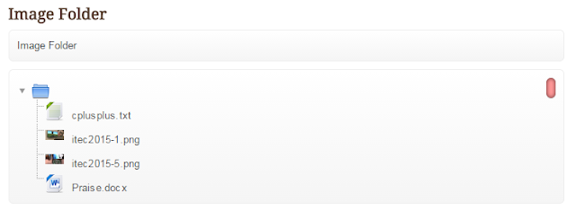
Here is my Moodle folder resource.

Figure 1. A normal-looking folder containing 2 image files, 1 text file and 1 Ms Word file.
Nothing out of the ordinary here....

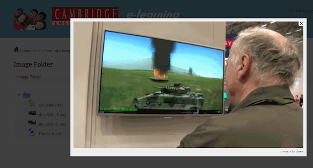
Figure 2. What happens when the file itec2015-1.png is clicked.
Whoa! It's a lightbox image effect. Click the 'x' to close.

Enable the Lightbox effect for an image hyperlink in a Label resource on your Moodle site


Photo credit: Lightbox-1 via photopin (license)

L
ightbox is a JavaScript library that displays images and videos by filling the screen, and dimming out the rest of the web page. The original JavaScript library was written by Lokesh Dhakar. The term Lightbox may also refer to other similar JavaScript libraries. Text is from: Lightbox (JavaScript) - Wikipedia, the free encyclopedia

In this post, I will show you how you can enable Lightbox for an image hyperlink in a Label resource on your Moodle site. The genesis of this post was the Blog Learning Rocks. Dan Roddy has written an average of one blog post a year for the last two years, and seven posts a year for the last six years. Which is not much, but this 2010 post of his has become my inspiration for today's post. In fact, thanks to Dan's post, I've also managed to enable the Lightbox effect on image files inside a Moodle folder resource! More on that later in another post on Moodurian.

Well, let's get started shall we?
Step 1: Surf to Dynamic Drive's Lightbox image viewer page.
Step 2: Download the file lightbox.zip
Step 3: Extract the contents of the lightbox.zip to your hard drive. You will see the folder named "lightbox" and its contents below:

Figure 1. Contents of lightbox.zip

Friday, May 1, 2015

A minimalist design approach to the Restricted Access resource as displayed on a Moodle course page.


Source: http://upload.wikimedia.org/wikipedia/commons/0/07/Taiwanese_Monk_at_the_Salar_of_Uyuni,_Bolivia.jpg
Note the clean whitespace around the monk? Very minimalistic, Zen-like and serene if you ask me.


Below is a file resource that has its Restrict Access settings set. It is grayed-out so that the user knows it is a conditional resource, and the critieria for its access is clear to all.
The displayed text "Not available unless: Your category is hq" means that the user cannot access (read) the resource unless his Custom Profile has been set to "hq". It serves a vital purpose and is useful when a student needs to be informed that a criteria needs to be met or score needs to be attained before he or she is allowed to access that resource.

In my humble opinion, I find the conditional text as intrusive to design of the course page. It does stick out and the eye cannot avoid it. I also think that sometimes the conditional text is redundant and would be better if it were not visible. For example, in the business context, some files may be made inaccessible to a user because the user is unconfirmed. He or she is still on probation. Hence, the Moodle administrator may want the staff to not click and access the resource, but only see the resource as being there on the course page.

The purpose of this post is to show you how to remove the conditional text. At the end of this post, your home will look like this:


Looks like that famous photo of Steve Jobs in his home with minimalistic furniture.
Photo by Benjamin Stockwell. Source: https://www.flickr.com/photos/kingbenny/5186217964/
License is Creative Commons Attribution, non-commercial use.

Okay, now seriously,  At the end of this post, your screens will looks like this:

How would you like to view a Moodle Quiz's Summary Of Attempt table in multiple column format instead of one long list

Source: http://en.wikipedia.org/wiki/Dead_Sea_Scrolls

This post is seventeen (17!) months in the making. Back then I was using Moodle 2.5. It took so long to do because back in November 2013, I was faced with the challenge of redesigning the Summary of Attempt table, but was easily defeated by the complexity of the quiz's renderer.php code.  Ah! Such is the agony of defeat. I found it too difficult to solve, so I left it by the wayside - only to re-attempt the problem in April 2015. You might say that the idea was gestating all this time. By the time I had the solution, which was on 29th April 2015, Moodle had evolved into Moodle 2.8.5. The feeling of the thrill of success is indescribable. Something to be savoured.

At the end of this post, you will be able to have your Moodle quiz display the "Summary of Attempt" in a whole new way, without the usual "scroll of death".

By default, the Summary Of Attempt table in a Moodle Quiz will display as a single column. So a quiz of 50 quiz questions will result in table that extends for most of the screen's height. Here's what my summary looks like with a quiz of 20 questions.

In the example above, I have to scroll all the way down to access and to click the "Submit all and Finish' or 'Return to attempt' buttons. Here's what the table looks like with 49 quiz questions!


Yikes! A long list is generated and I had to scroll all the way down the screen in order to click the "Submit all and finish" button. Now what happens when you have a quiz that consists of 60, 70, 80 or even 100 questions? Think about it.

Hmm.....now then...

Source: http://upload.wikimedia.org/wikipedia/en/d/d9/Thinking.jpg


...WHAT IF the table could be redesigned like the one below?


Firstly, the table is now divided into 3 separate columns. The questions snake up-down-and-left-to-right in fashion.  The question numbers are automatically and dynamically generated in their respective columns . In addition, the status of all unanswered questions are shown as red text so that the user has a instant visual cue.

Ratings and Recommendations by outbrain